

Showing posts with label Graphs. Show all posts
Showing posts with label Graphs. Show all posts
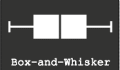
Five Point Summary : Box and Whisker Plots
You were Happy and Sad at the same time. If 90 makes you Happy and 80 makes you sad, Think again!
Well, the next day when visited his class, you received new information.
In Mathematics, everyone in the class got more than 90 marks and the class average is 95. In English, everyone is below your son. He is the topper! You are Happy and Sad again!
In Mathematics, everyone in the class got more than 90 marks and the class average is 95. In English, everyone is below your son. He is the topper! You are Happy and Sad again!
Well, that means more information, more clarity.
More the information does not mean all marks of all the children in all the subjects.
So, you need a summary. The best summary that can describe data is the 5 Point Summary.
So, you need a summary. The best summary that can describe data is the 5 Point Summary.
What
are those five points? ( The simple definitions are from wiki.paranormalcop.org)
2.First Quartile - the value above which there is 75% data
3.Median (second quartile) - the value which divides the data set into two equal halves, 50% above and 50% below
4.Third Quartile - the value above which there is 25% data
5.Maximum - the value above which there is no data.
These five points can be represented in a graph that is called Box and Whiskers plot.
Creating
Box plots in Excel are quite tricky as excel does not offer a straightforward
chart type for the same.
Here is a Box and Whiskers Plot template created for you.
You can create up
to 10 plots.
Download the excel from @Downloads .
This is a Do ..Co..Mo stuff: Download, Copy and Modify at your will.
Few
Ideas to get started.
1. Plot employee performance scores before and after training.
You may be able to find out the training impact!
2. Plot employees Incentive earnings
of last 2 years… You may understand the truth of employee earning!
by D.L. Massart,a J. Smeyers-Verbeke,a X. Caprona and Karin Schlesierb
Here is another great resource for special excel charts.
Easy Scatter Plot with 5 Dimensions..
 |
| This is a Scatter plot |
It is customary to plot Dependent variable on Y-Axis or vertical axis and Independent variable on X-Axis or horizontal axis.
Adding Labels to data points on a scatter plot in excel is a difficult task and is similar to creating and labelling bubble charts.
You need to add each variable and name (label) as a series... It's purely manual work...Here is a tool to make your job easy.
This is a tool created by Mathis from Clear Lines Consulting.
With a click of a button, you can create scatter plot with Two variables Plotted, with Labels, different Colors and different Markers.
( 2 Variables(X and Y) + Data Point shape for the category as another dimension + Color of the data point as one dimension and the Name of the data point as another. Totalling five dimensions)
You can also download the Excel workbook from Mathis’ post "Excel-ScatterPlot-with-labels-colors-and-markers".
This is a very useful tool! Thanks to Mathis...
Credits: Power Scatter Plot Excel sheet: Copyright © 2009, Clear Lines Consulting, LLC
http://www.clear-lines.com
Licensed under a Ms-PL license (http://www.opensource.org/licenses/ms-pl.html) : feel free to use and modify, but leave the © in if you distribute.
Alternatively, you can use a add-in to show labels on the graph.
An excel add-in called Labeler, created by Rob Bovey can be downloaded from here.
It is free. Try It!
Excel Add-In Credits:

Waterfall charts a.k.a Mario chart
Waterfall Charts are consultant's favourite charts!.
No wonder they are often referred to as McKinsey style waterfall chart!
Apparently, they look difficult to create but once you know the secret, it works like magic.
They are the best choice if you want to show how increments and decrements impact quantitative change in a given parameter.
No wonder they are often referred to as McKinsey style waterfall chart!
Apparently, they look difficult to create but once you know the secret, it works like magic.
They are the best choice if you want to show how increments and decrements impact quantitative change in a given parameter.

Let me explain.
In the year 2011, your company sales are 100K €. You have a plan to reach 330 K € by 2016.
Here is the data...
The data can be best shown in a waterfall chart. The chart looks like this
 |
Sales Projections from 2011-2016 increments
totalling to 2016 final sales shown in the waterfall chart
|
The trick is - arrangement of data and hiding some components of a normal stacked bar chart! I have explained the same in the attached excel. Have a look at it!
Even if you do not understand.... no problem.. use ready-made charts from the same excel! I have given 4 different scenarios of the same chart.
You can download the file from the Downloads @ section of LCDing.
It's a DOCOMO.. stuff (Download, Copy ,Modify)
Cartograms - It's a new World out there...
A couple of days back, I had an idea to create World Map based on variables such as Population, GDP, Per capita health care expenditure etc.
I was excited...I thought I found a new visualization model...I dreamt of ...name.....fame...new contribution to the world of visualization...
Then, I did a little search on Google. I understood such visualizations are in vogue and are called Cartograms...
In the end, I cursed that someone copied my idea even before I could conceive it...
However, I have come to terms with it...
Let's see what these Cartograms are..
For those who are familiar with Bubble Charts, understanding Cartogram is easy...
Cartograms are simply maps of the world wherein the size of an entity like a country or a Continent is proportional to the size of the variable being depicted.
 Let me give you an example.
If we were to create a Cartogram of the world based on the Area of each country, you will see the Map exactly like the world map we see... Like the one on the right side...
 If we were to create a cartogram of the world based on the Population of each Country, you will see the map like this. on the left side...
You will see the world from a different viewpoint...
World Mapper is one such brilliant site that Created innumerable Cartograms. Many are available for Free download as Posters...

Maps by Mark Newman, data by Danny Dorling, text by Anna Barford, quality
control by Ben Wheeler, website by John Pritchard, poster design by Graham
Allsopp, and individual country maps by Benjamin Hennig.
There are few software programs to create Cartograms.
Visit Cartogram Central for exploring the options.
I tried to recreate the same on Excel with varied results.
I will share with you the template once I have a fair amount of success. Share with me if you have any ideas on creating Cartograms in Excel.
Till then, enjoy World Mapper.
For more information on Cartogram, click the link below
Cartogram Types
I was excited...I thought I found a new visualization model...I dreamt of ...name.....fame...new contribution to the world of visualization...
Then, I did a little search on Google. I understood such visualizations are in vogue and are called Cartograms...
In the end, I cursed that someone copied my idea even before I could conceive it...
However, I have come to terms with it...
Let's see what these Cartograms are..
For those who are familiar with Bubble Charts, understanding Cartogram is easy...
Cartograms are simply maps of the world wherein the size of an entity like a country or a Continent is proportional to the size of the variable being depicted.

If we were to create a Cartogram of the world based on the Area of each country, you will see the Map exactly like the world map we see... Like the one on the right side...

You will see the world from a different viewpoint...
World Mapper is one such brilliant site that Created innumerable Cartograms. Many are available for Free download as Posters...
There are few software programs to create Cartograms.
Visit Cartogram Central for exploring the options.
I tried to recreate the same on Excel with varied results.
I will share with you the template once I have a fair amount of success. Share with me if you have any ideas on creating Cartograms in Excel.
Till then, enjoy World Mapper.
For more information on Cartogram, click the link below
Cartogram Types
Tree Maps
Have you ever heard of Tree Maps? In fact, a Tree map is a Big Brother of both Bar Charts and Pie Charts.
Tree-maps are a complex but powerful information visualization technique.
They were introduced in Shneiderman, 1992. Tree Maps are used to visualize hierarchical data as a set of nested rectangles.
As mentioned, the concept of tree-maps is basically from Ben Shneiderman
You can read a wonderful article by Ben Sheneiderman titled " Discovering Business Intelligence Using Tree-map Visualizations.
Tree maps can show relatives size of each component in the hierarchy and also use color coding to show another attribute. Here is an example of a simple tree-map .
This picture is taken from Wikipedia
The size of Rectangle denotes the waiting time for patients in NHS Primary care Trust in UK.
 There is another variant of Tree maps that uses circles instead of rectangles. Someone called it as pebbles. Here is an example of a pebbles Chart.
This shows GDP Per capita of countries in PPP Terms in $ International
This is the same data in a Tree chart
Creating Tree-maps is a Complex work and need considerable skills . Here I provide you two easiest ways to create Tree maps.
Try few Tree maps now....
Tree-maps are a complex but powerful information visualization technique.
They were introduced in Shneiderman, 1992. Tree Maps are used to visualize hierarchical data as a set of nested rectangles.
As mentioned, the concept of tree-maps is basically from Ben Shneiderman
You can read a wonderful article by Ben Sheneiderman titled " Discovering Business Intelligence Using Tree-map Visualizations.
Tree maps can show relatives size of each component in the hierarchy and also use color coding to show another attribute. Here is an example of a simple tree-map .
This picture is taken from Wikipedia
The size of Rectangle denotes the waiting time for patients in NHS Primary care Trust in UK.

This shows GDP Per capita of countries in PPP Terms in $ International
This is the same data in a Tree chart
Creating Tree-maps is a Complex work and need considerable skills . Here I provide you two easiest ways to create Tree maps.
1. Use Microsoft Excel
2. Use ManyEyes, an IBM Initiative to create and share data visualizations on Web
Visit my earlier Post on Many Eyes : Text Visualization-Many Eyes
Microsoft Research Provides a Free excel Add-in, that makes the job of creating Interactive Tree Maps in Excel easy.
Here is the link to download Excel Add-in
1.Tree Maps Free Excel add in - Link 1
2.Tree Maps Free Excel Add in - Alternative Link from Microsoft Store.
2.Tree Maps Free Excel Add in - Alternative Link from Microsoft Store.
for more advanced users who can handle xmls , Here is a site to download a Java based Tree visualization Programme. Here is the Link
According to the web site,
The project currently consists of a file browser demo, which visualizes the file system with the following tree diagrams:
- Hyperbolic Tree
- Circular Tree-map
- Rectangular Tree-map
- Sunburst Tree
- Icicle Tree
- Sunray Tree
- Iceray Tree
Tasks and Timelines
Projectization (I'm sure this is a new word!) of every task assigned is in vogue in every corporate!
Gantt charts are simple tools to represent the project schedule and status.
There are many types with various degree of complexity, however, a simple and easy Gantt chart can be created using excel.
 You will be essentially tracking
Here you can download the excel tool. you can also download it from @Downloads
Its a DO.. CO..MO.. stuff (Download, Copy ,Modify)
Gantt charts are simple tools to represent the project schedule and status.
There are many types with various degree of complexity, however, a simple and easy Gantt chart can be created using excel.

- Who will do?
- What will they do?
- When will they do?
- How long it takes to do?
Here you can download the excel tool. you can also download it from @Downloads
Its a DO.. CO..MO.. stuff (Download, Copy ,Modify)
The ' Z ' Graph for Sales - Short, Medium and Long-term Sales analysis - All at once at a glance!
Short, Medium and Long-term Sales analysis - All at once at a glance!
Sales progress is best shown in graphs.
Here is a consultant's style of showing Long-term, Medium-term and Short-term sales progress - all in one graph. All you need is, sales data for this year till this month, and the past 12 months of sales data.
The magic of the graph is it not only throws light on the long-term, medium-term and short-term, it also can show how good is your near future going to be!
The magic of the graph is it not only throws light on the long-term, medium-term and short-term, it also can show how good is your near future going to be!
Caution!
Show it only if you have healthy & right data...if you are facing projector lens :-)
Show it only if you have healthy & right data...if you are facing projector lens :-)
If you are the one on the other side of the lens , never forget to ask for this graph ;-)
This is called "Z" Graph.
Now let us see what are these long term, medium-term and short term sales progress
Long term sales progress is best represented by Rolling MAT
Long term sales progress is best represented by Rolling MAT
MAT - Moving Annual Total (sum of last 12 months data - till this month)
e.g: MAT Jan-11 = Feb-10 + Mar-10 +……+ Dec-10 + Jan-11
MAT Feb-11 = Mar-10 + Apr-10 +……+ Dec-10 + Feb-11
Medium term sales progress is best represented by YTD
YTD - Year To Date (Cumulative sales starting from the beginning of the year ..say JAN)
e.g. YTD Apr-11 = Jan-11 + Feb-11 + Mar-11 + Apr-11
YTD Jul-11 = Jan-11 + Feb-11 + Mar-11 + Apr-11 + May-11 + Jun-11 + Jul-11
Short term sales progress is best represented by monthly sales
e.g. Jan-11 , Feb-11 , Mar-11 , Apr-11.....
Bring all the data on to a single graph, it becomes a Z-Graph.
Bring all the data on to a single graph, it becomes a Z-Graph.
Do not undermine the Graph, the shape of “Z”, the angle inclination, slope of arms of “Z” can through new insights.
“Z” Graph is best for sales dashboards.
“Z” Graph is best for sales dashboards.
Once you plot MAT,YTD and Month, You should get a graph that more or less looks like this…
The 
Red line represents Rolling MAT
Blue represents YTD and
Green represents Monthly sales
Just to stir your thoughts, here I present you 3 scenarios!
The shape of the “Z” should give you the complete picture.

Here is one more idea to explore...
Plot your Months-To-Go and corresponding expected YTD and expected MAT figures as per the Targets/Quotas of Months-To-Go. You may get a perfect "Z" Ora a distorted "Z" like this.....

If the shape of "Z" is... as shown in the picture, it is obvious that risk is ahead unless you have a strategy to defy the trends!
All the best!
Download the excel workbook to understand better! Click Here
alternatively @downloads on this website
It's a DO.. CO..MO.. stuff (Download, Copy ,Modify)
Download the excel workbook to understand better! Click Here
alternatively @downloads on this website
It's a DO.. CO..MO.. stuff (Download, Copy ,Modify)
Acknowledgements and Reference article by David Straker
One visit to David Straker’s sites will make you a regular visitor.
....In his words….
Syque (pronounced 'sike') is my knowledge-sharing site.
My purpose is to share knowledge and understanding on an unprecedented scale, adding real value for individuals and companies. Consider it as 'original books on the internet', with already over 7,000 web pages of industrial-strength knowledge freely available.
Data Calisthenics : Gapminder Motion Chart - 5 ways to create these Motion Chart with your own data
Sometime back I wrote
blog post on Gapminder.
It’s one of the most viewed posts. Here is the link for the same:
The Fourth: Use Crystal Xcelsius
http://www.ideas2evidence.com/showcase.html
http://www.ideas2evidence.com/demos/CO2-demo.html
The Fifth : Use TrendCompass from Epic systems
It’s one of the most viewed posts. Here is the link for the same:
Having used and worked
with the motion chart, I found that many are fascinated by the
insights a Motion Chart (Gapminder) throws out.
Boring stats Can be transformed into brilliant data dancing!
Boring stats Can be transformed into brilliant data dancing!
As I explore the Web
world, I find many have tried various methods of presenting data the Gapminder
way
Here I list out the possibilities I have come across.
It's a compilation of various methods of creating Motion Charts.
Here I list out the possibilities I have come across.
It's a compilation of various methods of creating Motion Charts.
Each one is a masterpiece.. and efforts are worth a zillion claps....
The First: Use Google Docs
The easiest way to
make data dance.....
Google Docs: MotionChart : a Chart type in Google Docs
Another link to explore is Quick
Guide to Motion Chart
Here below is an example created by me with the Population and GDP of BRIC TM over a period of time.
The Second: Use Excel
Here below is an example created by me with the Population and GDP of BRIC TM over a period of time.
The Second: Use Excel
Making it possible in
excel
Jon Peltier, author of the famous
site http://peltiertech.com writes a post on how you can create motion charts in excel. Here
is the link to his post
Jorge Camoes in his famous blog excelcharts. Here is his post
Anand from his brilliant blog http://www.s-anand.net/blog/
Here is the link to his post
The Third: Use Tableau
Andy Cotgreave in his Awesome Blog Thedatastudio created a Motion chart with all possible
paraphernalia on Tableau
here below are the links
to his posts
The Fourth: Use Crystal Xcelsius
http://www.ideas2evidence.com/showcase.html
http://www.ideas2evidence.com/demos/CO2-demo.html
The Fifth : Use TrendCompass from Epic systems
Trend compass is commercial software from Epic systems.
Trend compass uses the basic idea of showing five variables in a single graph
(X,Y,Bubble size, Bubble Color and Time) as a motion chart.
Trend compass uses the basic idea of showing five variables in a single graph
(X,Y,Bubble size, Bubble Color and Time) as a motion chart.
The user interphase is quite intuitive and simple to create
Visualizations. However, for first time user, arranging data may be a challenge. The simple solution is to follow Trend Compass's instructions and their
model of Excel to arrange data.
Trend Compass helps you present your business data from your own desktop without the hassle of connecting to the internet and hopping between presentation and web.
Here is a demo of Trendcompass from the website http://www.epicsyst.com/test/v2/mastercard_vs_visa/
You can download a demo version that works for 30 days....
For those who want to start from the basics, you can watch the video below from Steve
Last but not least...
You can download Gapminder for desktop
Yet another great site for data is OECD- Factbook
Though You can not use these with your own data, You have enough and more to explore..
Now...Play.....
The Good and the Right chart to represent data.
To communicate a large amount of data & insight at a glance, the chart is the best choice.
Most often we find the charts incomplete and can not communicate as intended.
The other we often encounter is using an inappropriate Chart for the data.
Here are two presentations to bring you vital elements to make a good chart and the Right Chart for data.
Most often we find the charts incomplete and can not communicate as intended.
The other we often encounter is using an inappropriate Chart for the data.
Here are two presentations to bring you vital elements to make a good chart and the Right Chart for data.
Both are DOCOMO Stuff @Downloads.
Download, Copy and Modify at your will.
Here is another masterpiece. a white
paper on Communicating Numbers. Communicating Numbers.
Make business 'Sense' with Bubble Charts
If you are to present the four parameters say Brands, Growth, Market Share and Sales, on a graph to understand dynamics of the market,
A 'Bubble Chart' can easily show these four parameters on a single graph
We know X and Y Axis can show two data points.
The third one is the size of the point in the form of a Bubble and
The forth one is Color to distinguish between data points.
The third one is the size of the point in the form of a Bubble and
The forth one is Color to distinguish between data points.
So, in a Bubble chart, 4 Parameters can be shown
- Parameter 1: Brands can be shown in Color
- Parameter 2: Growth can be shown on X-Axis
- Parameter 3: Market Share can be shown on Y-Axis
- Parameter 4: Sales can be shown as the Size of a bubble
 |
| Bubble Chart Example: You can download the Template from Link given below |
One can easily create Bubble charts using excel.
However, when you are plotting multiple series of data points (Here in the example quoted above, it is the Region), you need to pain strikingly input each data point on the chart.
To make things easier, create a template and use the template every time.
I have created one such template for you.
Next time when are to create a bubble chart, just use the template!
You can download the excel file @Downloads
It's a DO..CO..MO.. stuff (Download, Copy , Modify )
It's a DO..CO..MO.. stuff (Download, Copy , Modify )
Google Insights
When people have internet access, What do they do? They Google!
Google captures the words that are used to search...
so with the power of the words that are used to search, Google can predict and plot trends.
Simple isn't it?
With this power, Google predicted the flu trends even before Centers for Disease Control and prevention could present the flu trends.
Google showcases the power of word searches in a simple and amazing tool called
Google Insights for Search
Go and get the insights.
Here are the videos.. get a hang of it...and Explore....
Watch this video for an overview of Google Insights for Search.
Watch this video to learn how to create effective advertising messages using Google Insights for Search.
Watch this video to learn how to evaluate brands using Google Insights for Search
Watch this video to learn how to measure the impact of your campaign using Google Insights for Search.
Data in. Brilliance Out. Tableau.
That’s the promise of Tableau…and indeed it lives up to its promise….
Tableau Public puts all spreadsheets to shame with its brilliant capabilities…
If you are in to serious analytics … Tableau public is a must!
Watch the Video….
Download the PowerPoint…Click the links….
Watch the Videos….
Learn… Get amazed …..and amaze others…..
It’s truly….
Data in. Brilliance Out.
Tableau Public puts all spreadsheets to shame with its brilliant capabilities…
If you are in to serious analytics … Tableau public is a must!
Watch the Video….
Download the PowerPoint…Click the links….
Watch the Videos….
Learn… Get amazed …..and amaze others…..
It’s truly….
Data in. Brilliance Out.
Trendline to tales…
The most uncomfortable situation for a sales manager is to predict next month sales with near accuracy. The paradox is that he is always confident and comfortable in predicting sales after two years…
Conversely in Mathematics, It’s just the other way round. Unless it’s MathemaTRICKS!
Do not hesitate to click the link and download the PowerPoint.
Copy it, Use it, Distribute it.
Conversely in Mathematics, It’s just the other way round. Unless it’s MathemaTRICKS!
You come across this incongruity every now and then in the domain of sales.
The use of Trendline is one of the good methodologies to forecast sales with a fair degree of certainty.
The use of Trendline is one of the good methodologies to forecast sales with a fair degree of certainty.
That's why it a prerequisite to understanding trend lines to learn to forecast.
Here is a PowerPoint presentation for you to understand better.
Here is a PowerPoint presentation for you to understand better.
The easiest way to create trend lines without much ado is to use God’s gift to the corporate citizen, "The spreadsheets". I used excel for this.
Do not hesitate to click the link and download the PowerPoint.
Copy it, Use it, Distribute it.
Data calisthenics with Motion Chart
Have you seen Hans Rosling’s presentation on TED? This was my earlier post!
If you missed it… watch it…
You may consider watching a 5 Minute video
Hans Rosling: 200 years in 4 minutes - BBC News
After recovering from the awe-inspiring presentation, the immediate question that strikes the mind of a data geek is ....can I use my own data for similar data calisthenics?
The answer is Yes!
Hans Rosling uses software called Gapminder conceptualized by him.
This was bought by Google.
It is available as free desktop download that can be used even without Internet connection.
http://www.gapminder.org/desktop/
This original Gap Minder has fixed data sets and these cannot be edited.
So what’s the alternative ?
Google showed the alternative…called Motion Chart!
In addition ,there is another free Option…
So, now we have two free Options
• Motion Chart by Google (it’s a Google Gadget for Google Docs)
• Trend Compass by Epic Systems.
• Now a day you can use Tableau Public also
Other Options include the use of crystal Xcelsius or even Excel.
However, both these options need skills of high order!
For the time being let’s limit ourselves with free and easy options.
Before trying to use the software, it’s worth while to read the one page basics and play around with the outcome.
One page basics and Guide
http://www.gapminder.org/GapminderMedia/wp-uploads/tutorial/Gapminder_World_Guide.pdf
Here is a video to watch
Here is the Motion chart I have created with GDP and Population of BRIC-TM countries.
Play with the data to understand the use of motion Chart.
If the motion Chart does not open on the website,Click the link Motion Chart Link to go to the Google doc and open "Gadget1"on the left bottom of your screen.
Now that you know basics of Gap Minder, use the alternative free option from Google.
Follow the steps given below
• Go to Google docs and open a spreadsheet (You need to log in with a Google account)
• The most vital part of Motion chart is preparation of spreadsheet
• Create the spreadsheet with your data
• The data you want to show as a bubble should be in the first column (e.g.: Countries, States, Territories Etc.)
• The year should be in the second column
• The data to compare should be in next columns
• Once the data is in place, go to insert and add gadget
• Select Motion chart Gadget
• Bang! your Motion chart is ready!
• Play!
• You can publish your work by copying the HTML code for your blog or company site…or else have an Internet connection while presenting the data
Here below is a sample Sheet and Link
For more details click and visit the link
http://docs.google.com/support/bin/answer.py?hl=en&answer=91610
The other Option is Epic System’s Trend Compass
Here is the link.
http://epicsyst.com/trendcompass/TrendCompass.aspx?home=1
All the best… Happy exploration…
TED Talks : Ideas worth spreading
Ted is a non-profit organization devoted to ideas worth spreading.
Ted's mission is spreading Ideas!
It's indeed a feast out there on TED website
http://www.ted.com/
 The website hosts videos - eminent personalities of the world sharing their ideas.
Ted's mission is spreading Ideas!
It's indeed a feast out there on TED website
http://www.ted.com/
the videos are awe-inspiring, jaw-dropping and ingenious.
Here I present you a video - "Hans Rosling shows the best stats you've ever seen".
Here I present you a video - "Hans Rosling shows the best stats you've ever seen".