

Showing posts with label Excel. Show all posts
Showing posts with label Excel. Show all posts
Column and Stacked Column - Mixed Chart in Excel and PowerPoint
Couple of days back a friend of mine
came to me and asked for help to create a chart that should
display the mother brand's objective as column chart and its line extensions sales achievement as stacked chart month by month.
This may also be used to show objective of the Brand Vs. Sales achievement of various SKUs.(
Well , neither Excel not PowerPoint has an option to mix two chart types in a single chart.
So, I tried
and created a simple cheat.
Here is the
Chart.

Take a look and use the PowerPoint template for the same.
Some day you might need it :-)
Concentration Curves : Tool for Resource Optimization
Every organization in these times is working against odds. One of
the major actions of organizations during tough times is Ephemeralization or "Do more with less"
This principle holds good not only for organizations but also individuals who are attempting to optimize resources available to them. All you need to do is identify is the resources!
There are many tools to undertake work towards Resource optimization. One of the easiest and fastest is creating "Concentration curves".
This demonstrates World GDP with GDP of countries on Y-Axis Vs No. of Countries on X-Axis.
I have created a Template for you. You can create concentration curves using your own data.

During these tough times, organizations need to
constantly evaluate their resource utilization and undertake Optimization of the process so that you can really "Do more with less".
To me, resource Optimization is not cutting resources. It’s
putting resources to good use.
This principle holds good not only for organizations but also individuals who are attempting to optimize resources available to them. All you need to do is identify is the resources!
There are many tools to undertake work towards Resource optimization. One of the easiest and fastest is creating "Concentration curves".
Once you understand the basic concept, you can use it with Resources and Outcomes like Sales Vs. People deployed, Sales Vs.
Expenses Sales Vs. Time invested etc.
Concentration curves are simply a Graphical representation of
Cumulated Outcomes Vs Cumulated Resources. In the graph,
~ The Vertical axis(Y-Axis)holds Cumulated Outcomes and
~ Horizontal Axis (X-Axis) holds Cumulated Resources.
~ The Vertical axis(Y-Axis)holds Cumulated Outcomes and
~ Horizontal Axis (X-Axis) holds Cumulated Resources.
So at a given point on the graph, you know exactly how much is
the Outcome Vs. Resources were used to generate the Outcome. Take a look at this example on concentration curves of GDP of 181 countries and their contribution to World GDP. You can observe that 35 Countries Contribute to 90% of the World GDP and the Rest of the 146 countries contribute to a mere 10% of the World GDP.

So the information you get will be something like this.
~ 20% of the field force give us about 80% of the sales
~ 40% of the money spent on the brand gave us 95% of the
sales
~ 25% of Territories are responsible for 70% of the Sales
generated
~ 20 Members out of 125 salesforces produce 75% of the Sales.
~ 20 Members out of 125 salesforces produce 75% of the Sales.
Does that ring a bell? Yes..
It's akin to Pareto Chart, Lorenz
Curves for Gini Calculations.
You may refer to my earlier post: What is GINI ? for more information
This demonstrates World GDP with GDP of countries on Y-Axis Vs No. of Countries on X-Axis.
I have created a Template for you. You can create concentration curves using your own data.
Here are 3 simple steps
1.Paste data in coloured cells. The rest of the computations are
automatic.(In fact computations are simple)
2.Tweak the slider to match your data (Shown in
downloadable excel file)
3.Read values at each data point by using the slider.
Download the Concentration
Curves Tool Here
This is a DOCOMO stuff! (Download,Copy and Modify at your will...You can find them @Downloads
Make life easy with Shortcuts

Like them or hate them! You have
no choice.
You may say to yourself that this
need not be your core skill. But deep in your heart, you know, you must be
fairly conversant with these Two 'God's Gifts' to corporate mankind for your
survival.
Here are PowerPoint and excel
shortcuts that can make your life easy. These were chosen after careful
consideration of the everyday work of an executive.
The Primordial necessities: Both Excel and PowerPoint
~ CTRL+C : Copy
~ CTRL+V : Paste
~ CTRL+Z : Undo the mistake
~ CTRL+S : Save
~ F7 :Spell Checker
PowerPoint S.Cuts.,
~ CTRL+ M : Insert New Slide
~ CTRL+SHIFT + > or < : Increase or Decrease font Size~ CTRL+ M : Insert New Slide
~ CTRL+ K : Create a Hyperlink
~ F5 : Go to Presentation Mode
~ Shift + F5 - View the slide show from the current slide forward
~ B or . (Period) : In the presentation mode to make the screen go Blank/Black and back to Presentation.
~ Home: Go to the First slide.
~ End : Go to the Last Slide
Excel S.Cuts.,
CTRL +Arrow keys : Go to the end of a Range ( Use Up/Down/Right/Left arrow keys)
~ CTRL+ Pageup or Page Down : Switch between worksheets
~ SHIFT+ Arrow Keys : Select a Cell Range
~ CTRL+SHIFT+Page up/Page down : Select a cell Range to the last cell with Data
~ ALT+ENTER : Insert a new line within a cell
~ F2 : Check the formula references
~ F4 : Add $ sign for a Reference
~ F11 : Select a cell range and show an instant graph.
Use them regularly. They can save your time!
Lots of Your Time. Trust me!
DIY : Sales Tracker - Simple and Effective
Everyone in sales knows the importance of Sales Data.
Tracking Sales vs. Quotas at periodic intervals helps you manage performance and earn incentives.
 ~ Can be used by Sales Representative as well as
Team leader.
~ Can be used by Sales Representative as well as
Team leader.
~ Can Track up to 15 territories and 15 Brands in each territory.
~ Month,YTD, Bi-Month, Quarter, 4 Month , Half year & Year intervals.
~ Sales at team level
~ Graphs showing sales progress and achievement of Quotas (Targets)
Sounds useful ? Go and Download the Sales Tracker from @Downloads or from BOX.You can also download Sales Tracker Demo with Dummy Data to get a feel of it.
Tracking Sales vs. Quotas at periodic intervals helps you manage performance and earn incentives.
Usually,Incentives on Sales are at various periods like Month,
Bi Month, Quarter, 4 Monthly, Half-Yearly and Yearly intervals.
Paying attention to Balance-To-Go for various brands at various time intervals helps you achieve overall sales goals, sales mix and earn 'hand'some incentives.
Here is a Sales Tracker for you...
Paying attention to Balance-To-Go for various brands at various time intervals helps you achieve overall sales goals, sales mix and earn 'hand'some incentives.
Here is a Sales Tracker for you...
It needs one-time “time” investment to plug in the data of last
year sales and Quotas (Targets) for this year. Sales data for current year needs to
be keyed in as months progress.
The Sales Tracker...
The Sales Tracker...
~ Can Track up to 15 territories and 15 Brands in each territory.
~ Month,YTD, Bi-Month, Quarter, 4 Month , Half year & Year intervals.
~ Sales at team level
~ Graphs showing sales progress and achievement of Quotas (Targets)
Sounds useful ? Go and Download the Sales Tracker from @Downloads or from BOX.You can also download Sales Tracker Demo with Dummy Data to get a feel of it.
It’s a DO.. CO .. MO stuff… Download,
Copy and Modify
as you please…
Please let me know your views...or leave a comment..
Share it if you have liked the post.
Please let me know your views...or leave a comment..
Share it if you have liked the post.
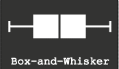
Five Point Summary : Box and Whisker Plots
You were Happy and Sad at the same time. If 90 makes you Happy and 80 makes you sad, Think again!
Well, the next day when visited his class, you received new information.
In Mathematics, everyone in the class got more than 90 marks and the class average is 95. In English, everyone is below your son. He is the topper! You are Happy and Sad again!
In Mathematics, everyone in the class got more than 90 marks and the class average is 95. In English, everyone is below your son. He is the topper! You are Happy and Sad again!
Well, that means more information, more clarity.
More the information does not mean all marks of all the children in all the subjects.
So, you need a summary. The best summary that can describe data is the 5 Point Summary.
So, you need a summary. The best summary that can describe data is the 5 Point Summary.
What
are those five points? ( The simple definitions are from wiki.paranormalcop.org)
2.First Quartile - the value above which there is 75% data
3.Median (second quartile) - the value which divides the data set into two equal halves, 50% above and 50% below
4.Third Quartile - the value above which there is 25% data
5.Maximum - the value above which there is no data.
These five points can be represented in a graph that is called Box and Whiskers plot.
Creating
Box plots in Excel are quite tricky as excel does not offer a straightforward
chart type for the same.
Here is a Box and Whiskers Plot template created for you.
You can create up
to 10 plots.
Download the excel from @Downloads .
This is a Do ..Co..Mo stuff: Download, Copy and Modify at your will.
Few
Ideas to get started.
1. Plot employee performance scores before and after training.
You may be able to find out the training impact!
2. Plot employees Incentive earnings
of last 2 years… You may understand the truth of employee earning!
by D.L. Massart,a J. Smeyers-Verbeke,a X. Caprona and Karin Schlesierb
Here is another great resource for special excel charts.
Easy Scatter Plot with 5 Dimensions..
 |
| This is a Scatter plot |
It is customary to plot Dependent variable on Y-Axis or vertical axis and Independent variable on X-Axis or horizontal axis.
Adding Labels to data points on a scatter plot in excel is a difficult task and is similar to creating and labelling bubble charts.
You need to add each variable and name (label) as a series... It's purely manual work...Here is a tool to make your job easy.
This is a tool created by Mathis from Clear Lines Consulting.
With a click of a button, you can create scatter plot with Two variables Plotted, with Labels, different Colors and different Markers.
( 2 Variables(X and Y) + Data Point shape for the category as another dimension + Color of the data point as one dimension and the Name of the data point as another. Totalling five dimensions)
You can also download the Excel workbook from Mathis’ post "Excel-ScatterPlot-with-labels-colors-and-markers".
This is a very useful tool! Thanks to Mathis...
Credits: Power Scatter Plot Excel sheet: Copyright © 2009, Clear Lines Consulting, LLC
http://www.clear-lines.com
Licensed under a Ms-PL license (http://www.opensource.org/licenses/ms-pl.html) : feel free to use and modify, but leave the © in if you distribute.
Alternatively, you can use a add-in to show labels on the graph.
An excel add-in called Labeler, created by Rob Bovey can be downloaded from here.
It is free. Try It!
Excel Add-In Credits:

Waterfall charts a.k.a Mario chart
Waterfall Charts are consultant's favourite charts!.
No wonder they are often referred to as McKinsey style waterfall chart!
Apparently, they look difficult to create but once you know the secret, it works like magic.
They are the best choice if you want to show how increments and decrements impact quantitative change in a given parameter.
No wonder they are often referred to as McKinsey style waterfall chart!
Apparently, they look difficult to create but once you know the secret, it works like magic.
They are the best choice if you want to show how increments and decrements impact quantitative change in a given parameter.

Let me explain.
In the year 2011, your company sales are 100K €. You have a plan to reach 330 K € by 2016.
Here is the data...
The data can be best shown in a waterfall chart. The chart looks like this
 |
Sales Projections from 2011-2016 increments
totalling to 2016 final sales shown in the waterfall chart
|
The trick is - arrangement of data and hiding some components of a normal stacked bar chart! I have explained the same in the attached excel. Have a look at it!
Even if you do not understand.... no problem.. use ready-made charts from the same excel! I have given 4 different scenarios of the same chart.
You can download the file from the Downloads @ section of LCDing.
It's a DOCOMO.. stuff (Download, Copy ,Modify)
Extracting bounced back email IDs from Outlook : Addressing the pain point in e-mail marketing
Email
marketing is abuzz!


With
great efforts you collect e mail Ids. With greater enthusiasm you send
e-mails.
Click
Send.
Give the system a sec…A series of bounced mail ids land in to your Inbox….
Give the system a sec…A series of bounced mail ids land in to your Inbox….
The reason , Wrong Mail
Ids…..
Now the job is to compile all wrong mail Ids from all those bounce back mails or Wrong mail Ids. It’s dreadfully painful (Is this expression correct ?)to go to each return mail and collect the Id.
Now the job is to compile all wrong mail Ids from all those bounce back mails or Wrong mail Ids. It’s dreadfully painful (Is this expression correct ?)to go to each return mail and collect the Id.

Recently
I faced similar challenge!
I Googled and bumped in to looooong Macros.
Some suggested Import export…I tried and failed with all those solutions and may be because of ability to understand and execute the solution... and then….
I Googled and bumped in to looooong Macros.
Some suggested Import export…I tried and failed with all those solutions and may be because of ability to understand and execute the solution... and then….
Falsh $#@%^&* Flash…….!
New Idea ! Indian Jugad ! Quick and
Dirty !
The
Idea is as simple as ... Select , Copy and Paste.
Ctrl + A , Ctrl + C and Ctrl + V.
Here
below is the explanation….
Open
the Outlook .
Keep
all mail Delivery failures in a Folder. Now do the following as shown in...
Picture 1 : On the fields bar , Select Field
Chooser
Picture 2 : Menu Opens up like this. Drag
to the fields bar
Picture 3 : Now you have “to” Mail Id and Other fields
Picture 3 : Now you have “to” Mail Id and Other fields

Now It's just Ctrl + A , Ctrl + C .
Open Excel and Ctrl + V.
Bingo… Now you have an excel with a column full of wrong mail Ids....
It was an eureka moment when I found the simplest solution. I
was remembering the story...Americans
had spent millions of dollars to invent a pen that writes in space where as
Russians wrote with pencil !
Jugaad Zindabad
Identifying level for description of IMS data in Excel
This post/ tip is for Pharma market research professionals who use IMS data.
IMS Health uses EphMRA (European Pharmaceutical Marketing Research Association) classification system across the world while producing data.
These codes when downloaded from some IMS Data sources are demarcated by several "empty spaces" before each code/description. As the excel download of the data will have hundred of rows, identifying the level through a formula will make analytics easy.
Here is a simple solution using excel formulae.
You can download the excel file here or @Downloads.
 |
Tree Maps
Have you ever heard of Tree Maps? In fact, a Tree map is a Big Brother of both Bar Charts and Pie Charts.
Tree-maps are a complex but powerful information visualization technique.
They were introduced in Shneiderman, 1992. Tree Maps are used to visualize hierarchical data as a set of nested rectangles.
As mentioned, the concept of tree-maps is basically from Ben Shneiderman
You can read a wonderful article by Ben Sheneiderman titled " Discovering Business Intelligence Using Tree-map Visualizations.
Tree maps can show relatives size of each component in the hierarchy and also use color coding to show another attribute. Here is an example of a simple tree-map .
This picture is taken from Wikipedia
The size of Rectangle denotes the waiting time for patients in NHS Primary care Trust in UK.
 There is another variant of Tree maps that uses circles instead of rectangles. Someone called it as pebbles. Here is an example of a pebbles Chart.
This shows GDP Per capita of countries in PPP Terms in $ International
This is the same data in a Tree chart
Creating Tree-maps is a Complex work and need considerable skills . Here I provide you two easiest ways to create Tree maps.
Try few Tree maps now....
Tree-maps are a complex but powerful information visualization technique.
They were introduced in Shneiderman, 1992. Tree Maps are used to visualize hierarchical data as a set of nested rectangles.
As mentioned, the concept of tree-maps is basically from Ben Shneiderman
You can read a wonderful article by Ben Sheneiderman titled " Discovering Business Intelligence Using Tree-map Visualizations.
Tree maps can show relatives size of each component in the hierarchy and also use color coding to show another attribute. Here is an example of a simple tree-map .
This picture is taken from Wikipedia
The size of Rectangle denotes the waiting time for patients in NHS Primary care Trust in UK.

This shows GDP Per capita of countries in PPP Terms in $ International
This is the same data in a Tree chart
Creating Tree-maps is a Complex work and need considerable skills . Here I provide you two easiest ways to create Tree maps.
1. Use Microsoft Excel
2. Use ManyEyes, an IBM Initiative to create and share data visualizations on Web
Visit my earlier Post on Many Eyes : Text Visualization-Many Eyes
Microsoft Research Provides a Free excel Add-in, that makes the job of creating Interactive Tree Maps in Excel easy.
Here is the link to download Excel Add-in
1.Tree Maps Free Excel add in - Link 1
2.Tree Maps Free Excel Add in - Alternative Link from Microsoft Store.
2.Tree Maps Free Excel Add in - Alternative Link from Microsoft Store.
for more advanced users who can handle xmls , Here is a site to download a Java based Tree visualization Programme. Here is the Link
According to the web site,
The project currently consists of a file browser demo, which visualizes the file system with the following tree diagrams:
- Hyperbolic Tree
- Circular Tree-map
- Rectangular Tree-map
- Sunburst Tree
- Icicle Tree
- Sunray Tree
- Iceray Tree
Tasks and Timelines
Projectization (I'm sure this is a new word!) of every task assigned is in vogue in every corporate!
Gantt charts are simple tools to represent the project schedule and status.
There are many types with various degree of complexity, however, a simple and easy Gantt chart can be created using excel.
 You will be essentially tracking
Here you can download the excel tool. you can also download it from @Downloads
Its a DO.. CO..MO.. stuff (Download, Copy ,Modify)
Gantt charts are simple tools to represent the project schedule and status.
There are many types with various degree of complexity, however, a simple and easy Gantt chart can be created using excel.

- Who will do?
- What will they do?
- When will they do?
- How long it takes to do?
Here you can download the excel tool. you can also download it from @Downloads
Its a DO.. CO..MO.. stuff (Download, Copy ,Modify)
The ' Z ' Graph for Sales - Short, Medium and Long-term Sales analysis - All at once at a glance!
Short, Medium and Long-term Sales analysis - All at once at a glance!
Sales progress is best shown in graphs.
Here is a consultant's style of showing Long-term, Medium-term and Short-term sales progress - all in one graph. All you need is, sales data for this year till this month, and the past 12 months of sales data.
The magic of the graph is it not only throws light on the long-term, medium-term and short-term, it also can show how good is your near future going to be!
The magic of the graph is it not only throws light on the long-term, medium-term and short-term, it also can show how good is your near future going to be!
Caution!
Show it only if you have healthy & right data...if you are facing projector lens :-)
Show it only if you have healthy & right data...if you are facing projector lens :-)
If you are the one on the other side of the lens , never forget to ask for this graph ;-)
This is called "Z" Graph.
Now let us see what are these long term, medium-term and short term sales progress
Long term sales progress is best represented by Rolling MAT
Long term sales progress is best represented by Rolling MAT
MAT - Moving Annual Total (sum of last 12 months data - till this month)
e.g: MAT Jan-11 = Feb-10 + Mar-10 +……+ Dec-10 + Jan-11
MAT Feb-11 = Mar-10 + Apr-10 +……+ Dec-10 + Feb-11
Medium term sales progress is best represented by YTD
YTD - Year To Date (Cumulative sales starting from the beginning of the year ..say JAN)
e.g. YTD Apr-11 = Jan-11 + Feb-11 + Mar-11 + Apr-11
YTD Jul-11 = Jan-11 + Feb-11 + Mar-11 + Apr-11 + May-11 + Jun-11 + Jul-11
Short term sales progress is best represented by monthly sales
e.g. Jan-11 , Feb-11 , Mar-11 , Apr-11.....
Bring all the data on to a single graph, it becomes a Z-Graph.
Bring all the data on to a single graph, it becomes a Z-Graph.
Do not undermine the Graph, the shape of “Z”, the angle inclination, slope of arms of “Z” can through new insights.
“Z” Graph is best for sales dashboards.
“Z” Graph is best for sales dashboards.
Once you plot MAT,YTD and Month, You should get a graph that more or less looks like this…
The 
Red line represents Rolling MAT
Blue represents YTD and
Green represents Monthly sales
Just to stir your thoughts, here I present you 3 scenarios!
The shape of the “Z” should give you the complete picture.

Here is one more idea to explore...
Plot your Months-To-Go and corresponding expected YTD and expected MAT figures as per the Targets/Quotas of Months-To-Go. You may get a perfect "Z" Ora a distorted "Z" like this.....

If the shape of "Z" is... as shown in the picture, it is obvious that risk is ahead unless you have a strategy to defy the trends!
All the best!
Download the excel workbook to understand better! Click Here
alternatively @downloads on this website
It's a DO.. CO..MO.. stuff (Download, Copy ,Modify)
Download the excel workbook to understand better! Click Here
alternatively @downloads on this website
It's a DO.. CO..MO.. stuff (Download, Copy ,Modify)
Acknowledgements and Reference article by David Straker
One visit to David Straker’s sites will make you a regular visitor.
....In his words….
Syque (pronounced 'sike') is my knowledge-sharing site.
My purpose is to share knowledge and understanding on an unprecedented scale, adding real value for individuals and companies. Consider it as 'original books on the internet', with already over 7,000 web pages of industrial-strength knowledge freely available.
Dymanic data on a Map - Easy method using Secret Camera object in Excel
Displaying excel data on a map is a complex task as of now.
First of all, you need to have Geocoding (latitude and longitude) of the places you want to map then create a KML map. Now, use either Internet or Google Earth to display map... It's really complex!
Here is a simple trick - hidden in excel!
This trick helps you display data automatically and with little tricks, you can make it dynamic.
You can also manipulate the data and display it by using a bit of imagination!
You got to use a "Camera Tool" in excel to do this
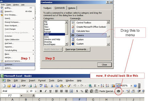
First, let me tell you where this Camera Object is hiding.... It's hidden in excel tools and you need to take it out first!
Step 1: Go to Tools on the main menu and click Customize
Step 2: In Customize,Go to Tools search for Camera.
Now hold that "Camera" and drag this to your to the toolbar on your excel.
Here is the picture to look at....
We are almost done!
First of all, you need to have Geocoding (latitude and longitude) of the places you want to map then create a KML map. Now, use either Internet or Google Earth to display map... It's really complex!
Here is a simple trick - hidden in excel!
This trick helps you display data automatically and with little tricks, you can make it dynamic.
You can also manipulate the data and display it by using a bit of imagination!
You got to use a "Camera Tool" in excel to do this
First, let me tell you where this Camera Object is hiding.... It's hidden in excel tools and you need to take it out first!
Step 1: Go to Tools on the main menu and click Customize
Step 2: In Customize,Go to Tools search for Camera.
Now hold that "Camera" and drag this to your to the toolbar on your excel.
Here is the picture to look at....
We are almost done!

In Excel 2010, The Navigation to find the Camera tool is here...

Now search for a map that meets your needs.
You can get enough and more on Google Image search - (Please check for copyrights...)
Paste the map on an excel sheet.
So now we have a Map pasted as an Image in excel and also the data to be displayed.
Now go the excel, select the range you want to display on the map
Click on the "Camera" - you will find the range - selected.
Now - leave it on the map! Adjust the size. Do a bit of formating. Now you have the object on the map...
The magic with this is it carries the reference with it!
Just to check, Select the object - you just left on the map.
You will find its reference in the formula bar!
So, any change you make for the reference cell, the data in the object changes accordingly!
I added Increase and decrease tabs to make data dynamic.
You can use colours, In-cell Graphs, Dynamically change data...using the formula!
The trick is here for you to explore
Rest, I leave to your imagination and innovation......explore it!
Take a look at the outcome.
Its a DO.. CO..MO.. stuff (Download, Copy ,Modify) You Can also download @downloads
You can get enough and more on Google Image search - (Please check for copyrights...)
Paste the map on an excel sheet.
So now we have a Map pasted as an Image in excel and also the data to be displayed.
Now go the excel, select the range you want to display on the map
Click on the "Camera" - you will find the range - selected.
Now - leave it on the map! Adjust the size. Do a bit of formating. Now you have the object on the map...
The magic with this is it carries the reference with it!
Just to check, Select the object - you just left on the map.
You will find its reference in the formula bar!
So, any change you make for the reference cell, the data in the object changes accordingly!
I added Increase and decrease tabs to make data dynamic.
You can use colours, In-cell Graphs, Dynamically change data...using the formula!
The trick is here for you to explore
Rest, I leave to your imagination and innovation......explore it!
Take a look at the outcome.
 |
| Download the excel here |
Data Calisthenics : Gapminder Motion Chart - 5 ways to create these Motion Chart with your own data
Sometime back I wrote
blog post on Gapminder.
It’s one of the most viewed posts. Here is the link for the same:
The Fourth: Use Crystal Xcelsius
http://www.ideas2evidence.com/showcase.html
http://www.ideas2evidence.com/demos/CO2-demo.html
The Fifth : Use TrendCompass from Epic systems
It’s one of the most viewed posts. Here is the link for the same:
Having used and worked
with the motion chart, I found that many are fascinated by the
insights a Motion Chart (Gapminder) throws out.
Boring stats Can be transformed into brilliant data dancing!
Boring stats Can be transformed into brilliant data dancing!
As I explore the Web
world, I find many have tried various methods of presenting data the Gapminder
way
Here I list out the possibilities I have come across.
It's a compilation of various methods of creating Motion Charts.
Here I list out the possibilities I have come across.
It's a compilation of various methods of creating Motion Charts.
Each one is a masterpiece.. and efforts are worth a zillion claps....
The First: Use Google Docs
The easiest way to
make data dance.....
Google Docs: MotionChart : a Chart type in Google Docs
Another link to explore is Quick
Guide to Motion Chart
Here below is an example created by me with the Population and GDP of BRIC TM over a period of time.
The Second: Use Excel
Here below is an example created by me with the Population and GDP of BRIC TM over a period of time.
The Second: Use Excel
Making it possible in
excel
Jon Peltier, author of the famous
site http://peltiertech.com writes a post on how you can create motion charts in excel. Here
is the link to his post
Jorge Camoes in his famous blog excelcharts. Here is his post
Anand from his brilliant blog http://www.s-anand.net/blog/
Here is the link to his post
The Third: Use Tableau
Andy Cotgreave in his Awesome Blog Thedatastudio created a Motion chart with all possible
paraphernalia on Tableau
here below are the links
to his posts
The Fourth: Use Crystal Xcelsius
http://www.ideas2evidence.com/showcase.html
http://www.ideas2evidence.com/demos/CO2-demo.html
The Fifth : Use TrendCompass from Epic systems
Trend compass is commercial software from Epic systems.
Trend compass uses the basic idea of showing five variables in a single graph
(X,Y,Bubble size, Bubble Color and Time) as a motion chart.
Trend compass uses the basic idea of showing five variables in a single graph
(X,Y,Bubble size, Bubble Color and Time) as a motion chart.
The user interphase is quite intuitive and simple to create
Visualizations. However, for first time user, arranging data may be a challenge. The simple solution is to follow Trend Compass's instructions and their
model of Excel to arrange data.
Trend Compass helps you present your business data from your own desktop without the hassle of connecting to the internet and hopping between presentation and web.
Here is a demo of Trendcompass from the website http://www.epicsyst.com/test/v2/mastercard_vs_visa/
You can download a demo version that works for 30 days....
For those who want to start from the basics, you can watch the video below from Steve
Last but not least...
You can download Gapminder for desktop
Yet another great site for data is OECD- Factbook
Though You can not use these with your own data, You have enough and more to explore..
Now...Play.....