

Showing posts with label Analysis. Show all posts
Showing posts with label Analysis. Show all posts
Making SFE Work for Field Force
Presentation during #FFE2016 organized by Medicin Man Mr.Anup Soans - 16th Feb 2016 on "Making SFE Work for Field Force" FFE 2016
Mean,Median and Mode - When and Where?
 If you know only 'Average' and do not know much about the words 'Mean', 'Median' and 'Mode’, you
are lucky!! Those who know, always get confused about When to use it? Which measure
to use?
If you know only 'Average' and do not know much about the words 'Mean', 'Median' and 'Mode’, you
are lucky!! Those who know, always get confused about When to use it? Which measure
to use? However, clarity helps understand things better.
Let us take the classical example of average income in two localities in Mumbai and try to understand these....
Locality 1, say Mulund where multi-storied flats co-exist with
slums around it.
Locality 2, say South Mumbai where only Multi-storied flats exist
and no slums.
Mean a.k.a Average
Mean a.k.a Average
When
to use Mean? Mean is also called Average.
You
average out when things are similar or symmetrical. Isn’t it?
So,
in the above-mentioned localities where do you use mean?
Obviously,
in a locality where you find similarity in the population.
i.e.
Locality 2 – only multi-storied flats.
Mean
is the best measure when the distribution is not skewed.
This means, when symmetry exists use Mean.
This means, when symmetry exists use Mean.
Median
Median
is the best choice in locality 1 because the distribution is skewed.
(High Income
of the people residing in flats and presumably low income in people residing in
slums).
Few
People who have disproportionately high income and few with very low income
(these are called Outliers) can completely skew and distort the picture.
So
, the moral of the story is next time when you are offered a job ask for the
median salary of the post rather than the average salary for the post offered!
Mode
Mode
is most recurring or most often seen.
Mode
is the least used measure of central tendency.
Often
you find it is not very meaningful.
Lets
take the example: The salaries in an office with 6 people are as follows.
Rs.10,000,
Rs.10,000, Rs.7,590, Rs.7,550, Rs.2,200 and Rs.7,565.
So, the
Mode is most recurring i.e. Rs. 10,000 ( it appeared Twice).
This
is not reflecting central tendency. It’s meaningless.
But
where do you find Mode useful?
Let’s
take this example which may be more meaningful for Gentlemen!
You are standing in a typical Mumbai
Bus stop and watching women's dressing!
A
Sari , Jeans, Chudidaar or Skirts.
At At the end of the day, if you are not arrested by Police, you come to a
conclusion, that most women in Mumbai wear Jeans! (Quite an insight).
So,
Mode is the best measure for Nominal data (such as Sex, Race, Ethnicity,
Country etc.)
To summarize,
Mean is the Average, Median is Middle and Mode is Most often.
Mean
tells the basic character of a population. It does not represent an individual
from the population. In reality, you may not find anyone matching the mean in
the population.
Median
represents a typical Individual from the population.
Mode
is most often observed.
Learn with this simple song for a better understanding..
DIY : Sales Tracker - Simple and Effective
Everyone in sales knows the importance of Sales Data.
Tracking Sales vs. Quotas at periodic intervals helps you manage performance and earn incentives.
 ~ Can be used by Sales Representative as well as
Team leader.
~ Can be used by Sales Representative as well as
Team leader.
~ Can Track up to 15 territories and 15 Brands in each territory.
~ Month,YTD, Bi-Month, Quarter, 4 Month , Half year & Year intervals.
~ Sales at team level
~ Graphs showing sales progress and achievement of Quotas (Targets)
Sounds useful ? Go and Download the Sales Tracker from @Downloads or from BOX.You can also download Sales Tracker Demo with Dummy Data to get a feel of it.
Tracking Sales vs. Quotas at periodic intervals helps you manage performance and earn incentives.
Usually,Incentives on Sales are at various periods like Month,
Bi Month, Quarter, 4 Monthly, Half-Yearly and Yearly intervals.
Paying attention to Balance-To-Go for various brands at various time intervals helps you achieve overall sales goals, sales mix and earn 'hand'some incentives.
Here is a Sales Tracker for you...
Paying attention to Balance-To-Go for various brands at various time intervals helps you achieve overall sales goals, sales mix and earn 'hand'some incentives.
Here is a Sales Tracker for you...
It needs one-time “time” investment to plug in the data of last
year sales and Quotas (Targets) for this year. Sales data for current year needs to
be keyed in as months progress.
The Sales Tracker...
The Sales Tracker...
~ Can Track up to 15 territories and 15 Brands in each territory.
~ Month,YTD, Bi-Month, Quarter, 4 Month , Half year & Year intervals.
~ Sales at team level
~ Graphs showing sales progress and achievement of Quotas (Targets)
Sounds useful ? Go and Download the Sales Tracker from @Downloads or from BOX.You can also download Sales Tracker Demo with Dummy Data to get a feel of it.
It’s a DO.. CO .. MO stuff… Download,
Copy and Modify
as you please…
Please let me know your views...or leave a comment..
Share it if you have liked the post.
Please let me know your views...or leave a comment..
Share it if you have liked the post.
Deja vu.. Black Berry

It was a couple of years ago, myself
and my colleagues on our way to the office were discussing ‘Blackberry Boys' and we all felt that BB
will die soon.
We could peep into the future with ease...easily but wonder how BB missed it and messed it! It is Hot on the web to discuss reasons for BB’s debacle...
We could peep into the future with ease...easily but wonder how BB missed it and messed it! It is Hot on the web to discuss reasons for BB’s debacle...
However, My take is…
- Respect the Customer.
- Listen.
- Unlearn to Re-learn.
Starting from the day your confidence gets appended
with ‘over’, your days are numbered.
Take a look at the videos. they thought that it's market-shaping!
Well, the market shaped the RIM.
Take a look at the videos. they thought that it's market-shaping!
Well, the market shaped the RIM.
Two years later, RIM is dead and BB10 is a new avatar.
If BB is to rise like a Phoenix, It will have to patiently wait for iPhone or Samsung to do the same mistake!
If BB is to rise like a Phoenix, It will have to patiently wait for iPhone or Samsung to do the same mistake!
Not surprisingly, I get a sense of deja vu after iPhone 5 launch and iphone 6 previews.
This is the ' Market Shaping' BlackBerry Indian ad..
This is the ' Market Shaping' BlackBerry Indian ad..
Here is an article closely related to this article from Strategy+Business
Yesterday's 8 GB is todays 32 GB !!!
Maybe my ignorance.
Maybe it a simple issue for a finance professional but, I failed to understand...

The story goes like this....I bought an 8 GB SD card from a leading
"TRUSTworthy" electronics store in Jan'12 for Rs.1200.Now, in Jan
2013 This SD card conked out!
I
took it to store as it is under warranty and the store gracefully agreed to
replace it. He had 2 choices
Choice 1: Replace an 8GB Piece
Choice 2: Give back Money and ask me
to buy goods worth Rs.1200 (Incase my goods exceed Rs.1200/- I need to pay the difference amount)
When
I requested Option 2, the store manager agreed.
So, I had Rs 1200 /- to purchase.
So, I had Rs 1200 /- to purchase.
In lieu of an 8GB Card, I purchased a 32GB card for the same Rs 1200. (Nowadays a
32 GB SD Card costs ~ 1200)
No
extra money or difference of money was paid.
Now, my gain is 8GB to 32GB for the same Rs.1200
( Should I consider Rupee devaluation in 1 year + Inflation as my extra gain ? )
( Should I consider Rupee devaluation in 1 year + Inflation as my extra gain ? )
How
about to Store? I understand the intangible gain like goodwill etc.
Other
than those intangible issues, Did the store Gain ? or No Loss-No Gain or Notional Loss?
Though no one measures P&L on a single SD Card, If we were to compute what is the P&L?
I am confused @#$%^&
Though no one measures P&L on a single SD Card, If we were to compute what is the P&L?
I am confused @#$%^&
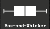
Five Point Summary : Box and Whisker Plots
You were Happy and Sad at the same time. If 90 makes you Happy and 80 makes you sad, Think again!
Well, the next day when visited his class, you received new information.
In Mathematics, everyone in the class got more than 90 marks and the class average is 95. In English, everyone is below your son. He is the topper! You are Happy and Sad again!
In Mathematics, everyone in the class got more than 90 marks and the class average is 95. In English, everyone is below your son. He is the topper! You are Happy and Sad again!
Well, that means more information, more clarity.
More the information does not mean all marks of all the children in all the subjects.
So, you need a summary. The best summary that can describe data is the 5 Point Summary.
So, you need a summary. The best summary that can describe data is the 5 Point Summary.
What
are those five points? ( The simple definitions are from wiki.paranormalcop.org)
2.First Quartile - the value above which there is 75% data
3.Median (second quartile) - the value which divides the data set into two equal halves, 50% above and 50% below
4.Third Quartile - the value above which there is 25% data
5.Maximum - the value above which there is no data.
These five points can be represented in a graph that is called Box and Whiskers plot.
Creating
Box plots in Excel are quite tricky as excel does not offer a straightforward
chart type for the same.
Here is a Box and Whiskers Plot template created for you.
You can create up
to 10 plots.
Download the excel from @Downloads .
This is a Do ..Co..Mo stuff: Download, Copy and Modify at your will.
Few
Ideas to get started.
1. Plot employee performance scores before and after training.
You may be able to find out the training impact!
2. Plot employees Incentive earnings
of last 2 years… You may understand the truth of employee earning!
by D.L. Massart,a J. Smeyers-Verbeke,a X. Caprona and Karin Schlesierb
Here is another great resource for special excel charts.
Text Visualizations with manyeyes

You can explore and
create spectacular and compelling data visualizations. The name
of the site is apt as you can view data through "manyeyes".
well in addition to normal
visualizations, the best part of the site is text analytics. This is quite important in
the context that everyone is viewing to get insights of from huge piles of data
generated on social media! Bringing out essence from text is
made possible through various text analytical tools available.
Here, I present you the way religions
describe The God. I have taken from Internet how various religions
describe The God.
Sabka
Malik Ek......means - One God Governs All
This is how It appears if I create a
Word Cloud without editing data!
This is an example.
You can load your own data like text
of your own speech, text from an article etc. and analyze the essence of the
text!
Just to ignite your
thoughts...
~ Use the brand message text...
~ Use your CEO's Speech...
~ Use your brand detailing story...
~ Use text from your own presentation....
~ Use Ted Transcripts
~ Use your CEO's Speech...
~ Use your brand detailing story...
~ Use text from your own presentation....
~ Use Ted Transcripts
I recommend Word
Cloud and Word Tree
Word
Cloud to know what the
audience will hear from you (Top most repeated words. Obviously! )
Word
Tree to know how a word is
contexted.
Visit the site Watch the Video to
learn more! Click the link.
Cartograms - It's a new World out there...
A couple of days back, I had an idea to create World Map based on variables such as Population, GDP, Per capita health care expenditure etc.
I was excited...I thought I found a new visualization model...I dreamt of ...name.....fame...new contribution to the world of visualization...
Then, I did a little search on Google. I understood such visualizations are in vogue and are called Cartograms...
In the end, I cursed that someone copied my idea even before I could conceive it...
However, I have come to terms with it...
Let's see what these Cartograms are..
For those who are familiar with Bubble Charts, understanding Cartogram is easy...
Cartograms are simply maps of the world wherein the size of an entity like a country or a Continent is proportional to the size of the variable being depicted.
 Let me give you an example.
If we were to create a Cartogram of the world based on the Area of each country, you will see the Map exactly like the world map we see... Like the one on the right side...
 If we were to create a cartogram of the world based on the Population of each Country, you will see the map like this. on the left side...
You will see the world from a different viewpoint...
World Mapper is one such brilliant site that Created innumerable Cartograms. Many are available for Free download as Posters...

Maps by Mark Newman, data by Danny Dorling, text by Anna Barford, quality
control by Ben Wheeler, website by John Pritchard, poster design by Graham
Allsopp, and individual country maps by Benjamin Hennig.
There are few software programs to create Cartograms.
Visit Cartogram Central for exploring the options.
I tried to recreate the same on Excel with varied results.
I will share with you the template once I have a fair amount of success. Share with me if you have any ideas on creating Cartograms in Excel.
Till then, enjoy World Mapper.
For more information on Cartogram, click the link below
Cartogram Types
I was excited...I thought I found a new visualization model...I dreamt of ...name.....fame...new contribution to the world of visualization...
Then, I did a little search on Google. I understood such visualizations are in vogue and are called Cartograms...
In the end, I cursed that someone copied my idea even before I could conceive it...
However, I have come to terms with it...
Let's see what these Cartograms are..
For those who are familiar with Bubble Charts, understanding Cartogram is easy...
Cartograms are simply maps of the world wherein the size of an entity like a country or a Continent is proportional to the size of the variable being depicted.

If we were to create a Cartogram of the world based on the Area of each country, you will see the Map exactly like the world map we see... Like the one on the right side...

You will see the world from a different viewpoint...
World Mapper is one such brilliant site that Created innumerable Cartograms. Many are available for Free download as Posters...
There are few software programs to create Cartograms.
Visit Cartogram Central for exploring the options.
I tried to recreate the same on Excel with varied results.
I will share with you the template once I have a fair amount of success. Share with me if you have any ideas on creating Cartograms in Excel.
Till then, enjoy World Mapper.
For more information on Cartogram, click the link below
Cartogram Types
The ' Z ' Graph for Sales - Short, Medium and Long-term Sales analysis - All at once at a glance!
Short, Medium and Long-term Sales analysis - All at once at a glance!
Sales progress is best shown in graphs.
Here is a consultant's style of showing Long-term, Medium-term and Short-term sales progress - all in one graph. All you need is, sales data for this year till this month, and the past 12 months of sales data.
The magic of the graph is it not only throws light on the long-term, medium-term and short-term, it also can show how good is your near future going to be!
The magic of the graph is it not only throws light on the long-term, medium-term and short-term, it also can show how good is your near future going to be!
Caution!
Show it only if you have healthy & right data...if you are facing projector lens :-)
Show it only if you have healthy & right data...if you are facing projector lens :-)
If you are the one on the other side of the lens , never forget to ask for this graph ;-)
This is called "Z" Graph.
Now let us see what are these long term, medium-term and short term sales progress
Long term sales progress is best represented by Rolling MAT
Long term sales progress is best represented by Rolling MAT
MAT - Moving Annual Total (sum of last 12 months data - till this month)
e.g: MAT Jan-11 = Feb-10 + Mar-10 +……+ Dec-10 + Jan-11
MAT Feb-11 = Mar-10 + Apr-10 +……+ Dec-10 + Feb-11
Medium term sales progress is best represented by YTD
YTD - Year To Date (Cumulative sales starting from the beginning of the year ..say JAN)
e.g. YTD Apr-11 = Jan-11 + Feb-11 + Mar-11 + Apr-11
YTD Jul-11 = Jan-11 + Feb-11 + Mar-11 + Apr-11 + May-11 + Jun-11 + Jul-11
Short term sales progress is best represented by monthly sales
e.g. Jan-11 , Feb-11 , Mar-11 , Apr-11.....
Bring all the data on to a single graph, it becomes a Z-Graph.
Bring all the data on to a single graph, it becomes a Z-Graph.
Do not undermine the Graph, the shape of “Z”, the angle inclination, slope of arms of “Z” can through new insights.
“Z” Graph is best for sales dashboards.
“Z” Graph is best for sales dashboards.
Once you plot MAT,YTD and Month, You should get a graph that more or less looks like this…
The 
Red line represents Rolling MAT
Blue represents YTD and
Green represents Monthly sales
Just to stir your thoughts, here I present you 3 scenarios!
The shape of the “Z” should give you the complete picture.

Here is one more idea to explore...
Plot your Months-To-Go and corresponding expected YTD and expected MAT figures as per the Targets/Quotas of Months-To-Go. You may get a perfect "Z" Ora a distorted "Z" like this.....

If the shape of "Z" is... as shown in the picture, it is obvious that risk is ahead unless you have a strategy to defy the trends!
All the best!
Download the excel workbook to understand better! Click Here
alternatively @downloads on this website
It's a DO.. CO..MO.. stuff (Download, Copy ,Modify)
Download the excel workbook to understand better! Click Here
alternatively @downloads on this website
It's a DO.. CO..MO.. stuff (Download, Copy ,Modify)
Acknowledgements and Reference article by David Straker
One visit to David Straker’s sites will make you a regular visitor.
....In his words….
Syque (pronounced 'sike') is my knowledge-sharing site.
My purpose is to share knowledge and understanding on an unprecedented scale, adding real value for individuals and companies. Consider it as 'original books on the internet', with already over 7,000 web pages of industrial-strength knowledge freely available.
Data Calisthenics : Gapminder Motion Chart - 5 ways to create these Motion Chart with your own data
Sometime back I wrote
blog post on Gapminder.
It’s one of the most viewed posts. Here is the link for the same:
The Fourth: Use Crystal Xcelsius
http://www.ideas2evidence.com/showcase.html
http://www.ideas2evidence.com/demos/CO2-demo.html
The Fifth : Use TrendCompass from Epic systems
It’s one of the most viewed posts. Here is the link for the same:
Having used and worked
with the motion chart, I found that many are fascinated by the
insights a Motion Chart (Gapminder) throws out.
Boring stats Can be transformed into brilliant data dancing!
Boring stats Can be transformed into brilliant data dancing!
As I explore the Web
world, I find many have tried various methods of presenting data the Gapminder
way
Here I list out the possibilities I have come across.
It's a compilation of various methods of creating Motion Charts.
Here I list out the possibilities I have come across.
It's a compilation of various methods of creating Motion Charts.
Each one is a masterpiece.. and efforts are worth a zillion claps....
The First: Use Google Docs
The easiest way to
make data dance.....
Google Docs: MotionChart : a Chart type in Google Docs
Another link to explore is Quick
Guide to Motion Chart
Here below is an example created by me with the Population and GDP of BRIC TM over a period of time.
The Second: Use Excel
Here below is an example created by me with the Population and GDP of BRIC TM over a period of time.
The Second: Use Excel
Making it possible in
excel
Jon Peltier, author of the famous
site http://peltiertech.com writes a post on how you can create motion charts in excel. Here
is the link to his post
Jorge Camoes in his famous blog excelcharts. Here is his post
Anand from his brilliant blog http://www.s-anand.net/blog/
Here is the link to his post
The Third: Use Tableau
Andy Cotgreave in his Awesome Blog Thedatastudio created a Motion chart with all possible
paraphernalia on Tableau
here below are the links
to his posts
The Fourth: Use Crystal Xcelsius
http://www.ideas2evidence.com/showcase.html
http://www.ideas2evidence.com/demos/CO2-demo.html
The Fifth : Use TrendCompass from Epic systems
Trend compass is commercial software from Epic systems.
Trend compass uses the basic idea of showing five variables in a single graph
(X,Y,Bubble size, Bubble Color and Time) as a motion chart.
Trend compass uses the basic idea of showing five variables in a single graph
(X,Y,Bubble size, Bubble Color and Time) as a motion chart.
The user interphase is quite intuitive and simple to create
Visualizations. However, for first time user, arranging data may be a challenge. The simple solution is to follow Trend Compass's instructions and their
model of Excel to arrange data.
Trend Compass helps you present your business data from your own desktop without the hassle of connecting to the internet and hopping between presentation and web.
Here is a demo of Trendcompass from the website http://www.epicsyst.com/test/v2/mastercard_vs_visa/
You can download a demo version that works for 30 days....
For those who want to start from the basics, you can watch the video below from Steve
Last but not least...
You can download Gapminder for desktop
Yet another great site for data is OECD- Factbook
Though You can not use these with your own data, You have enough and more to explore..
Now...Play.....
Sales Forecasting : Easy and Simple

Sales Forecasting is a Paradox.
Theoretically, Faaaarther the Period, Poorer the Reliability.
Whereas, in the real world its the opposite...This month, not very sure; year end, guarantee. ;-)
I may not solve the Paradox but, here is a easy and simple tool to forecast sales.
Two simple rules and a bit of Stats were used to create this tool in Excel.
~ The near future most likely will be an extension of our known past....
Like we know that tomorrow should more or less will be like today...The Armageddon is far away
~ Seasonality exists in sales and the reason may not always be the Mother nature
Like we know soft drinks sell during summer and on a sales closing day, we do more sales
Download the Excel and take a look at the Powerpoint to understand and use the tool.
This is a DOCOMO stuff! (Download,Copy and Modify at your will...You can find them @Downloads
Computing trendline values in Excel
Forecasting is an Art,Science,Social studies,Maths and more !
Use of trends can make forecasting easy ! And God's gift to corporate mankind can make it easier !( Well, I 'am referring to Excel)
However, the trend line in excel does not display the values it holds. Computing the values on excel is an extremely confusing stuff .
You need to use innumerable formulae in excel to arrive at the values.
Just to make the job easy, here I present a way to do it. I have also attached an excel file link in the presentation. You can download the same and use it.
Alternatively you can download it from my BOX: Trendlines.XLS
Computing trendline values in excel
 |
| From www.Forexmillion.com |
However, the trend line in excel does not display the values it holds. Computing the values on excel is an extremely confusing stuff .
You need to use innumerable formulae in excel to arrive at the values.
Just to make the job easy, here I present a way to do it. I have also attached an excel file link in the presentation. You can download the same and use it.
Alternatively you can download it from my BOX: Trendlines.XLS
Computing trendline values in excel
Segmentation Variables
Pharma Customer Segmentation Variables for India and most of the EMs.
Many a time I searched the net for Segmentation variables. Every time I failed.
So,I decided to create one. Here is the list...
Maybe not the perfect one. But, serves to ignite new ideas. It may serve some who wish to just believe in my understanding of the market and go with this list.
Maybe not the perfect one. But, serves to ignite new ideas. It may serve some who wish to just believe in my understanding of the market and go with this list.
Yes! You may take the list as it is..it has over 125 segmentation variables...
The real success of the use lies in selecting the parameter that best suits your brand!
That, I leave it to your Wisdom.
The real success of the use lies in selecting the parameter that best suits your brand!
That, I leave it to your Wisdom.
you may download the file here: my downloads page.
Remember even though it is Pharma specific, with small tweaks here and there it can serve every industry!
If you wish to thank me, please Comment. If you have no comments to offer, Share with others.

Triocto Model
 |
| Triocto Model |
2 X 2 Matrix is well known to all of us. Thanks to BCG!
3 X 3 Matrix will create utter confusion !
By the way 3 X 3 - Will it be a Matrix or a Cube ?
Here is the middle path. A 3X3 matrix on 2 dimensional grid.
Simple , Easy and Effective !
Those who use 2X2 matrix more often in their corporate lives, they can understand in a jiffy by looking at this icon!
Take a look at this presentation.... and to download, Click here
The Good and the Right chart to represent data.
To communicate a large amount of data & insight at a glance, the chart is the best choice.
Most often we find the charts incomplete and can not communicate as intended.
The other we often encounter is using an inappropriate Chart for the data.
Here are two presentations to bring you vital elements to make a good chart and the Right Chart for data.
Most often we find the charts incomplete and can not communicate as intended.
The other we often encounter is using an inappropriate Chart for the data.
Here are two presentations to bring you vital elements to make a good chart and the Right Chart for data.
Both are DOCOMO Stuff @Downloads.
Download, Copy and Modify at your will.
Here is another masterpiece. a white
paper on Communicating Numbers. Communicating Numbers.